
The modern web programming environment of HTML/CSS/JavaScript is surprisingly flexible. Unfortunately, people have used that flexibility to implement some astoundingly bad User Interface designs.
Users come to your page to do four actions:
Web browsers have been letting Users do those actions since the 1990s. It's simple and pleasant and powerful. Everyone from toddlers to octogenarians can use the web via this model, and enjoy it and derive value from it. One would think that the added capabilities of modern HTML/CSS/JavaScript would be used by designers to help Users do the above actions even easier and better. One would be sorely disappointed.
Good User Interface helps Users do these actions. Bad User Interface gets in the way of Users doing these actions. This short list of Commandments is intended to help you avoid the worst errors.
The First Commandment of User Interface is that it's for the Users. It's not so you can exercise the latest super nifty CSS tricks or show off your l33t coding skillz. It's not to optimize ad clicks or search engine placement. It's not to buff your résumé with a nice-looking "beta" (really barely alpha) which you then leave behind for others to fix up. The one and only purpose of User Interface is to make things simple and pleasant and powerful for the Users. If you are coding UI for any reason other than this, you're doing it wrong.
Once a UI element has appeared on the page it must not move, except in response to User action. This is because the User may be attempting to click on that element. If you move it, that can cause mis-clicks.
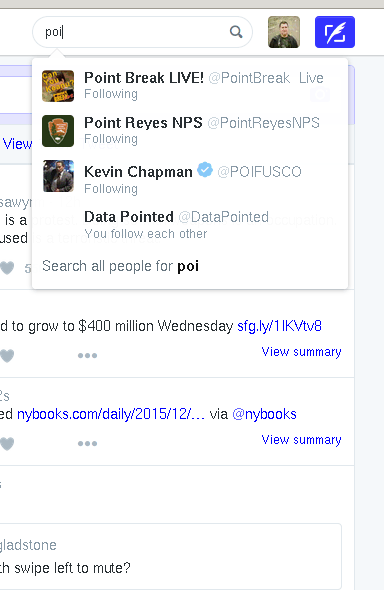
An example of this is the search hints in Twitter. When the User types some text into Twitter's search box, it shows some hints immediately. Then a little later it shows some more hints. The second batch of hints shoves the first batch down the page. If the User was attempting to click on a hint in the first batch, there can easily be a mis-click. The delay between the two batches can be anywhere from half a second to five or ten seconds. Sometimes there is no second batch at all. A clever User who waits for the second batch to show up before attempting a click has to wait an uncertain, often annoyingly long, and occasionally infinite time.
All Twitter would have to do to avoid this problem is add the second batch of hints below the first batch, so the first batch does not move. This is an easy and general solution.
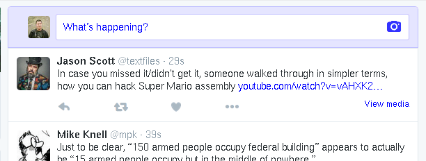
Another example from Twitter is the "View N new Tweets" notification. A couple times per minute Twitter checks if there are any new tweets to show. If there are, it puts up a notification. The User can click it to get the new tweets. However, the notification pushes all the existing tweets down the page. If the User was about to click on something and the notification pushes it down the page, that can cause a mis-click.
Again there is an easy and general fix: reserve space for anything that appears without User action. Reserve a blank area above the tweets where the new tweets notification can appear. Easy peasy.
Of course the most common violator of this Commandment is: ads. When an ad-infested page loads, it spends the first minute or so jumping around while all the ads figure out how big they want to be. Reserve space for the ads and this no longer happens. If your advertisers complain that you're breaking their precious ad code: get new advertisers.
Do not scroll the page. That is the User's job.
Never use :hover for anything other than decoration.
Foo.
Foo.
Foo.
You must give the User an indication that the page is still loading.
Use left/right and up/down to mean the same thing consistently.
Back to Jef's page.
